Then i scanned them in and imported them using Photoshop:
The images were not clear or bold enough for me to use at this point, so i edited them in Photoshop.
First, bringing the contrast way up and compensating by taking the brightness down.


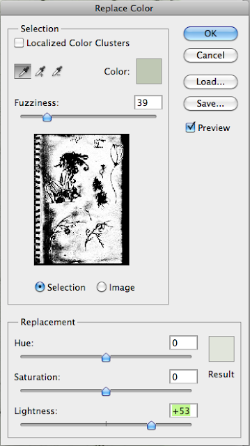
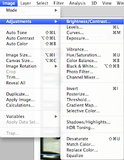
The adjustment worked well for the drawn lines in terms of tone, but darkened the white background, so i compensated using the Replace Colour tool. Shown on the right:
Next i used the images to start building my poster, adapting parts of the image as i went. To start putting colour to the image i applied a green tinge to the elements.
I did this by duplicating the image twice, then leaving the first image alone, applied the Neon Glow filter to the second layer and then inverted it:
After that i applied to the Vivid Light blending mode to the layer:
Then on the third (and top) layer and applied the Multiply blending mode and in some cases the Overlay blending mode.
You can also see in the printscreen (left) that there is a layer mask on the group containing the three layers, i used that to clean up some of the pencil noise that had come through with the scan and editing.
For the lower left corner elements of my poster i found an image containing an Art Nouveau seeming pattern. In Photoshop i adjusted the image to bring out more of a dark glow, and applied the Dark Strokes filter.

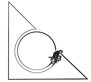
I then prepared a simple corner piece using Illustrator, using a fancy stroke to match my theme.
Then using another Layer Mask and the Magic Wand tool i spliced the pattern into the constraints of the corner element.
By the end my Layers panel was pretty crammed up, lucky i use folders to keep things organized. Alriiiiight i'm awesome.
After a while i wanted to use the girl for another part of my project. I flattened the image in order to transfer it and edit it more efficiently.
I designed these plant-like patterns using Illustrator, then imported them into Photoshop and arranged them as a back-drop.
Finally, I gave the entire image a pale blue background.


No comments:
Post a Comment